Capture More Leads
Drive resume uploads and contact details from FAANG-aspiring professionals at scale.
Interview Kickstart — 2025
End-to-end design of a high-converting lead magnet that also generated over $500K+ in sales, in a rapid 3-week timeline.
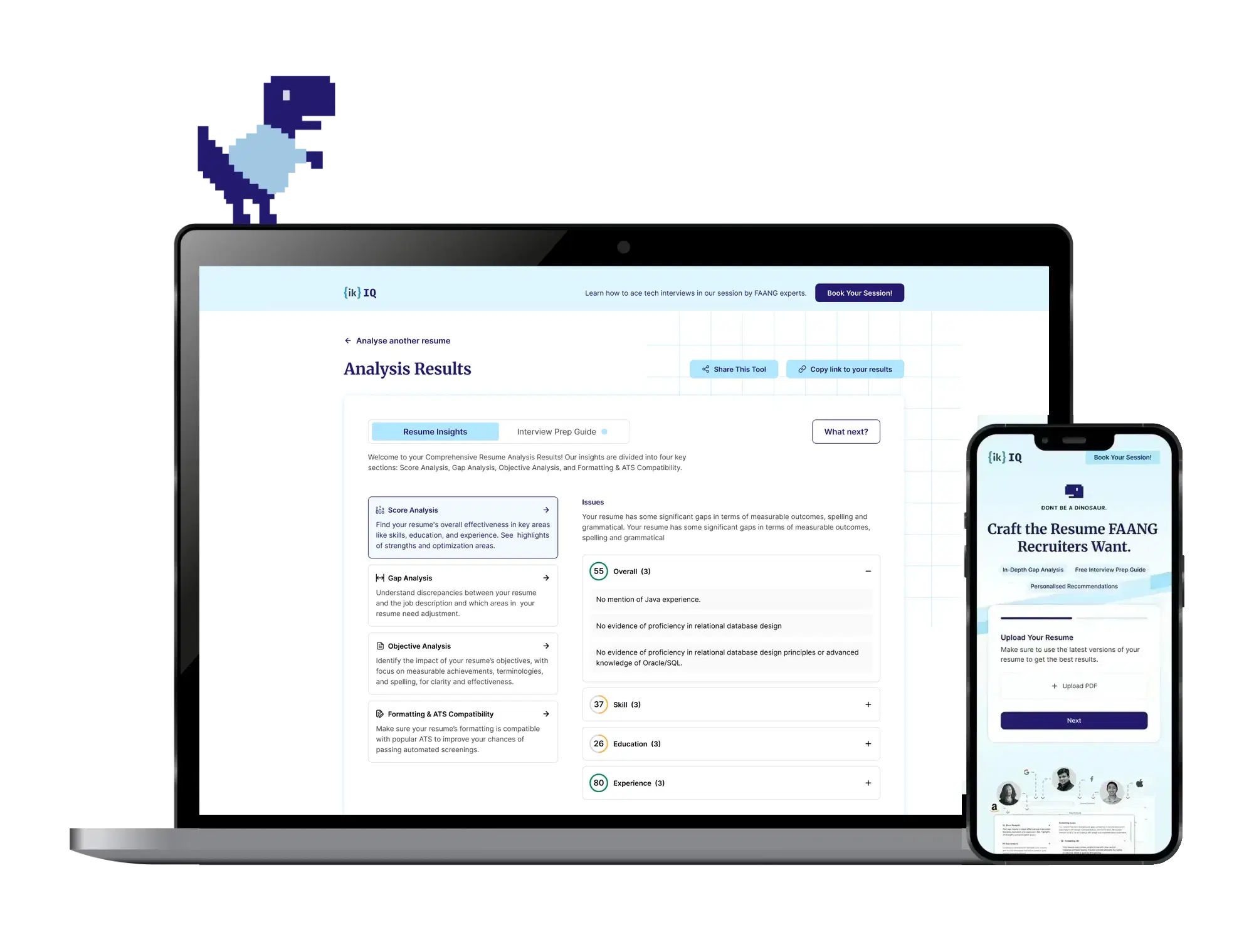
The Brief
Interview Kickstart offers high-ticket courses, so customer acquisition cost was steep. They needed a way to attract and pre-qualify serious candidates before any sales conversation began.
Drive resume uploads and contact details from FAANG-aspiring professionals at scale.
Prove IK's depth of knowledge before the user invests time or trust.
Move engaged users from insight → intent → booking an expert session.
Main goals of the project
The Output
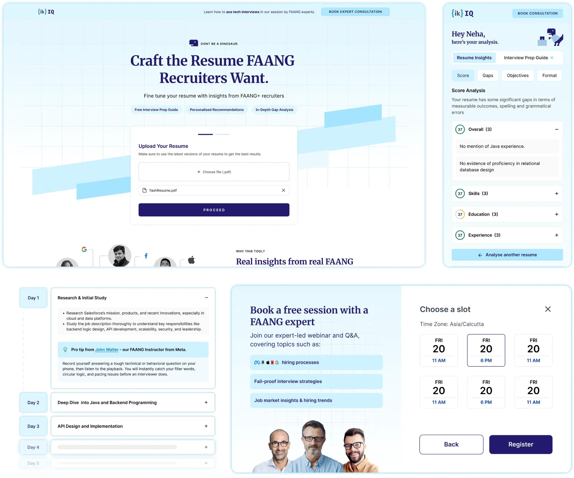
What this tool does
At a glance
$500K+
Direct revenue generated
3K+
Resumes analysed quarterly
3 wks
Brief to handoff
11K+
Quarterly sessions
Process
01
I reviewed the top resume analysis tools at that time — Resume Worded, Kickresume, Enhancv, Wellfound. All followed the same pattern:
“Analyses seemed generic, with long wait times and confusing reports.”
02
I looked at user reviews, discussion threads on Reddit, and our alumni Discord. I also met with 5 senior tech professionals from both India & US in my network who fit the target group.
User quotes
I don't really use these tools, I prefer insights from real people.
→ MAKE IT FEEL HUMAN, NOT AI-GENERATED
I want to know exactly what part of my resume triggers the ATS to reject it.
→ ATS-SPECIFIC ANALYSIS SECTION
I don't really get actionable feedback most times.
→ PRESCRIPTIVE, NOT JUST DESCRIPTIVE
Design implications
Targeted insights on what an ATS expects
Advice inspired by real FAANG experiences
Compare resume against the target role, not a generic benchmark
Go beyond analysis — show how to translate it into a good interview
Most importantly — do not make it feel like generic advice generated by AI.
03
Mapped the end-to-end flow from landing to webinar sign-up, designing each stage around what the user needs to feel confident enough to proceed.
01
User submits resume
Low-friction upload. Trust markers visible upfront.
02
Suggest roles / get preferred role
Roles suggested from resume. JD paste as optional depth.
03
Get analysis & contextual suggestions
Design solve for latency.
Loading state04
Explore personalised recommendations
10-day plan + course nudges in context.
05
Nudge to webinar sign-up
Tied to specific resume gaps found.
04
Although the outline of the content was given to us by the curriculum team, I collaborated with them to group the topics into logical categories, name them, and set sentence limits to pass onto the core prompt.
Score Analysis
A brief overview to sum up the whole analysis in quantifiable scores
Gap Analysis
Highlight what we're comparing the resume to, and exactly where it lags
Objective Analysis
How to reframe resume content in a more impactful way
Formatting & ATS Compatibility
Addressing areas at risk of ATS rejection and any left-out errors
Responses were to be modelled on information & interview feedback from FAANG mock interviewers
05
I stuck to IK's blue theme and colour palette, keeping it minimal, but trying to break the seriousness with mascots and little quirks — most notably the dino character, which carries the brand personality across the entire tool.
Design Output
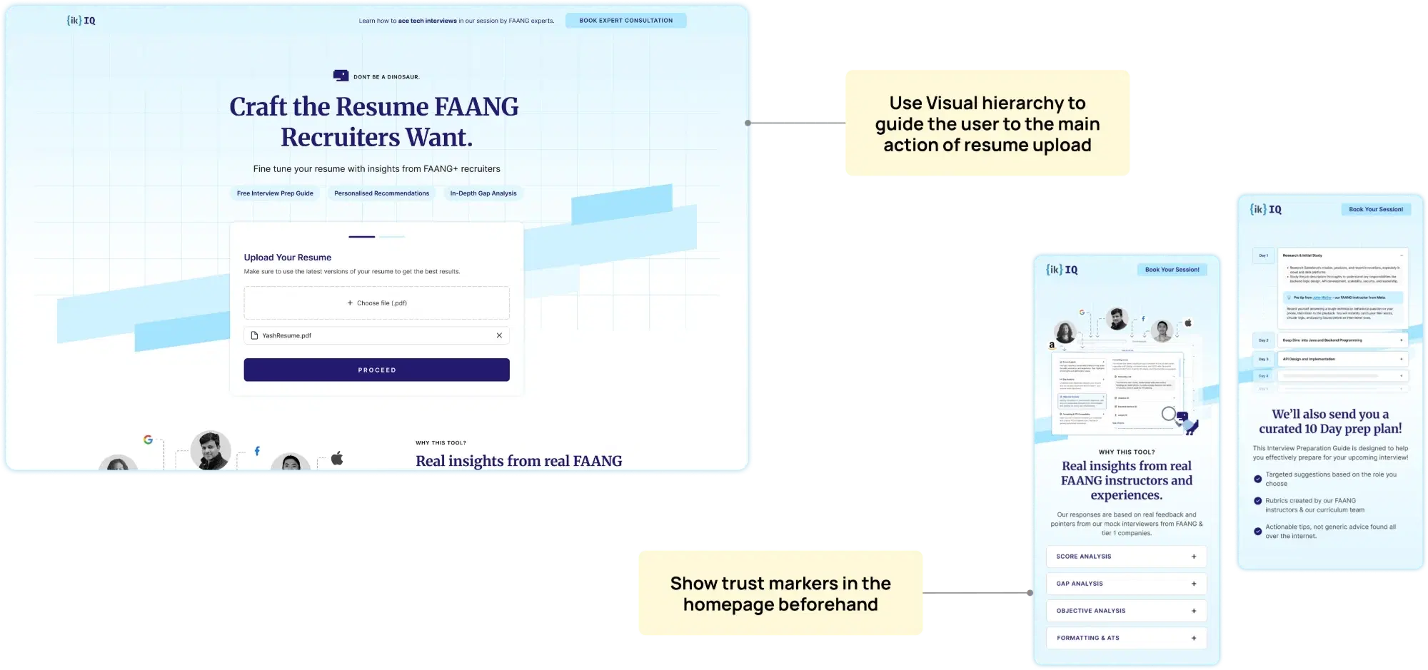
Landing page
Use visual hierarchy to guide the main action
Headline, sub-headline and upload zone are the primary focus. All secondary content lives below the fold.
Show trust markers upfront
Real insights from real FAANG instructors and experiences. Responses based on mock interviewers from FAANG & tier 1 companies.
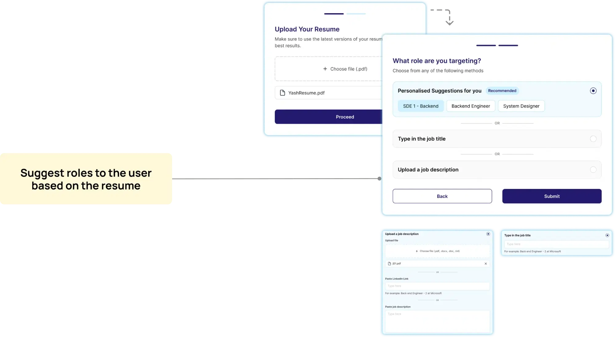
Role targeting
In most cases, the role the user wants is suggested by us — reducing friction to just a click, instead of typing. In other cases, multiple input methods are offered for specific roles or JDs.
Key design decision
Tech team mentioned cases where it took ~20 seconds for the API response to reach us — exactly when users would be most likely to leave. I suggested a mini game — an homage to Chrome's dino, instantly recognisable to anyone in tech. It broke the ice while we captured missing contact details and showed resume tips.
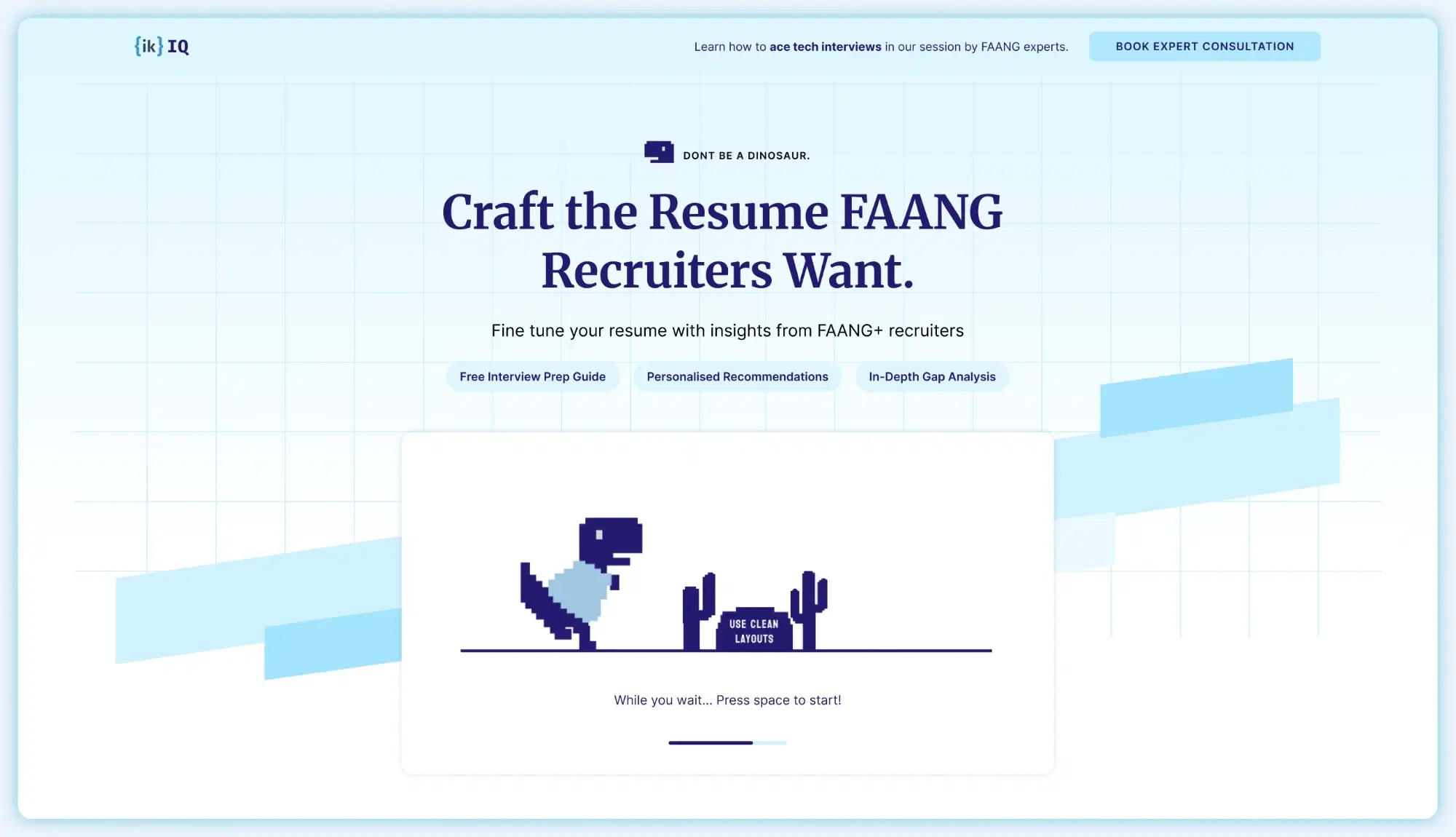
Try it yourself
PRESS SPACE TO START
000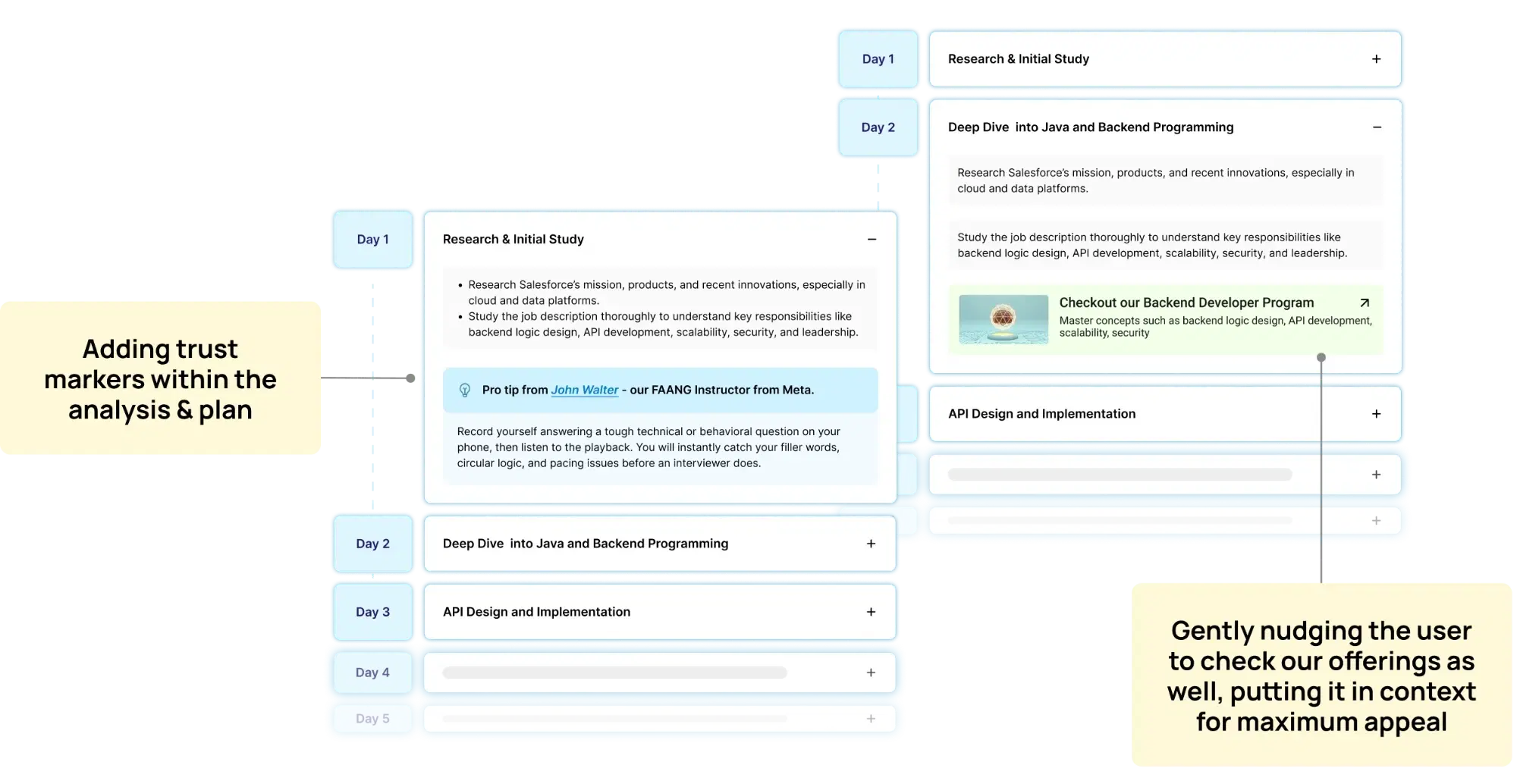
10-day action plan
Curated day-by-day preparation guide with pro tips from named FAANG instructors. Retains trust markers — making course suggestions feel like a natural continuation, not a push.
Gently nudging the user to check our offerings, putting it in context for maximum appeal.
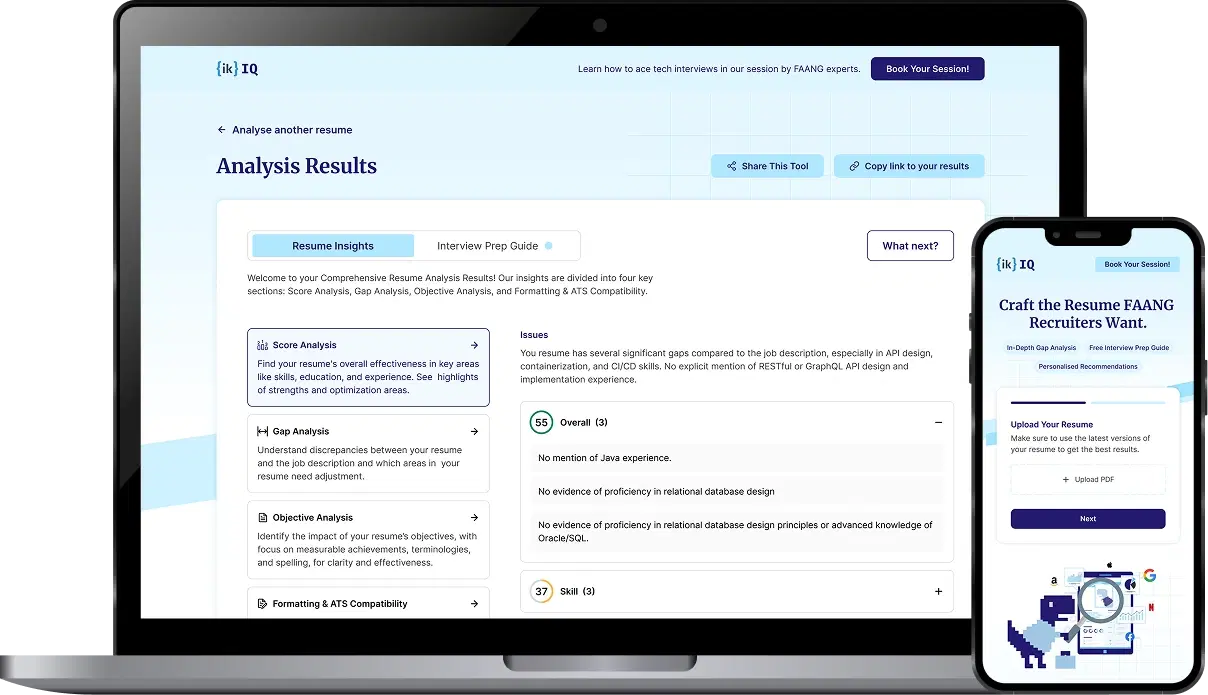
Results page
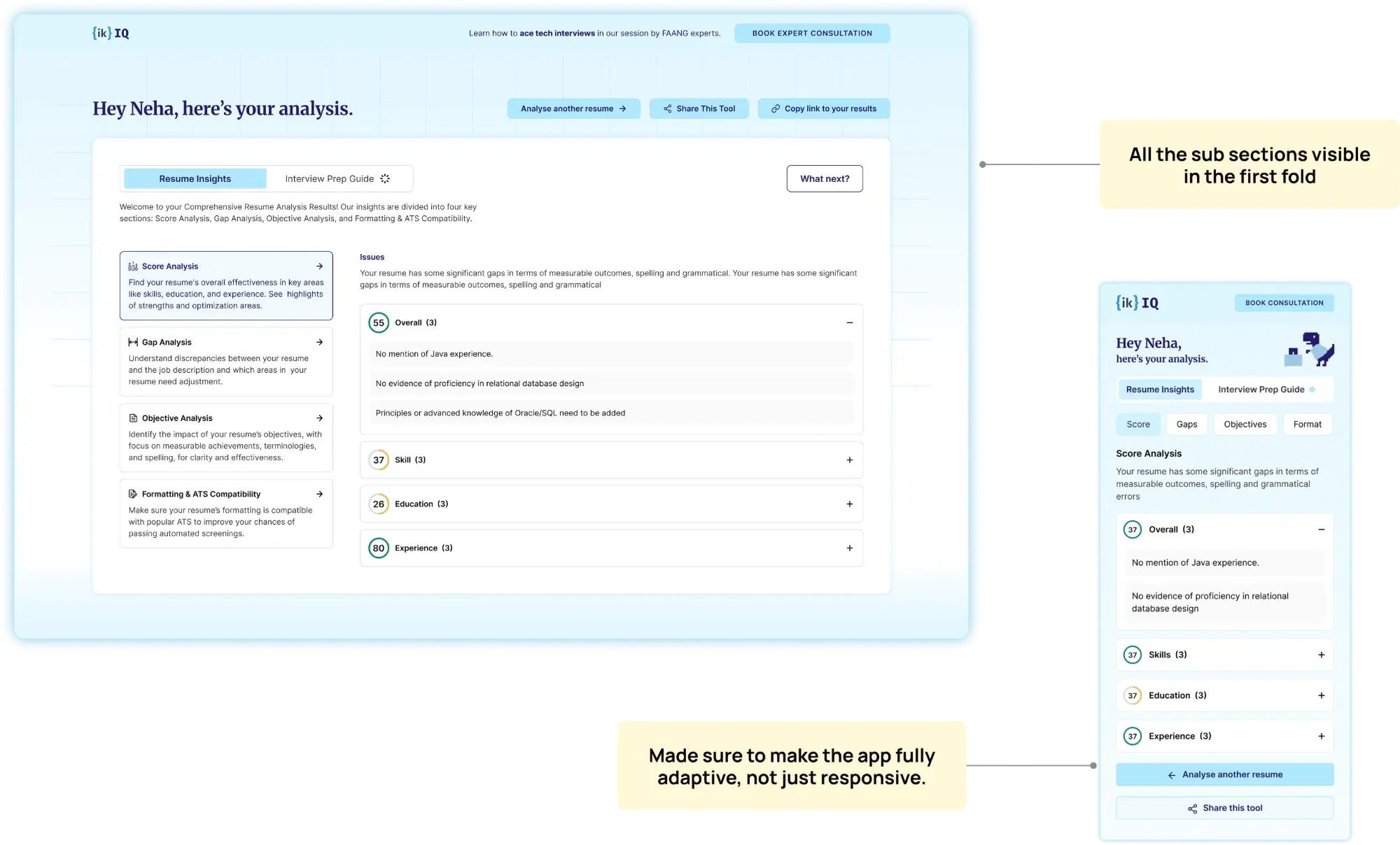
All subsections visible in the first fold
Score Analysis · Gap Analysis · Objective Analysis · Formatting & ATS — all surfaced immediately so users see the full scope.
Colour-coded score chips per section
Overall · Skill · Education · Experience — colour-coded with expandable accordion detail for each section.
Fully adaptive, not just responsive
Mobile layout reorganises the hierarchy — tabs collapse to chips, accordions reprioritise for thumb reach.
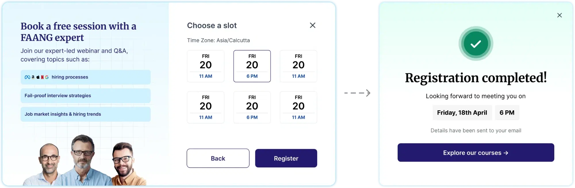
Webinar CTA
Using the webinar slot booking step as an exit-intent popup to re-capture users who have finished reading and are about to leave.
Using the webinar slot booking step as exit intent popup to re-capture disengaged audience.
Implementation
The initial 3-week sprint shipped the core — some features were de-scoped due to bandwidth and strategic decisions.
Shipped ✓
✓ Core user flow
✓ Analysis structure
✓ Responsive design
De-scoped ✗
✗ Mini game — no bandwidth, used animation instead
✗ Proof section — to keep page distraction-free
✗ Course suggestion — felt too pushy
Performance & Impact
I went through the Clarity analytics dashboard and tracked 90 days of data from Q2 2026. Here are some key indicators of performance.
Landing page
Key action is clear
GoodUpload & Proceed are the highest-clicked elements — 160, 153, 136 clicks respectively. Retain this visual hierarchy.
91.3% hit 50% scroll depth
GoodOn average across both pages — strong signal of user engagement with the content.
4.42% reach Proceed
InvestigateMost don't advance far enough to become leads. Possible role choice overload at the targeting step.
9.35% dead-click rate
ResolvedLater discovered as elements firing with latency, and a few cases of tags being clicked on. Edited in later versions after reviewing 30+ session recordings.
Analysis page
Only 17.4% reach bottom
Action needed91.3% hit 50% depth but only 17.4% reach the bottom. Important webinar CTAs should not depend on bottom-of-page exposure.
Low webinar CTA interaction
ContextDoesn't make sense to click when they are reading the analysis. CTA placement needs to follow the analysis journey, not sit above it.
Bottom line
3K+
Resumes analysed quarterly
$500K+
Direct revenue generated (2024–25)
3 wks
Brief to handoff
The tool earned appreciation internally and circulated organically in student communities — praised for how it looked and how fast it returned results.
Iteration 2
Taking insights from Clarity data, and quick usability tests with people in my network.
Redesign elements that are seen to cause dead clicks
Make the page visually less monotonous
Add more details about the webinar, to increase curiosity
Remove some input methods in the role selection step
Use a more conversational method of resume collection
Use visuals and animations, to make it less wordy
Dhananjay Kumar Gupta · Product Designer
Thanks for reading the whole thing.
Designed & developed by — yours truly.