Student Journey
→
→
Interview Kickstart · 2024–25 · LMS Redesign

Student Dashboard Redesign
to Re-engage & Boost
Course Completion.

Redesigning the UpLevel LMS dashboard to make student progress visible, actionable, and personal — addressing the silent drop-off problem at its root.
Role
Lead Product Designer
Company
InterviewKickstart
Product
UpLevel LMS
Collaborators
PM · 2 Engineers · SSA Team
Scope
Dashboard · Notifications · Search
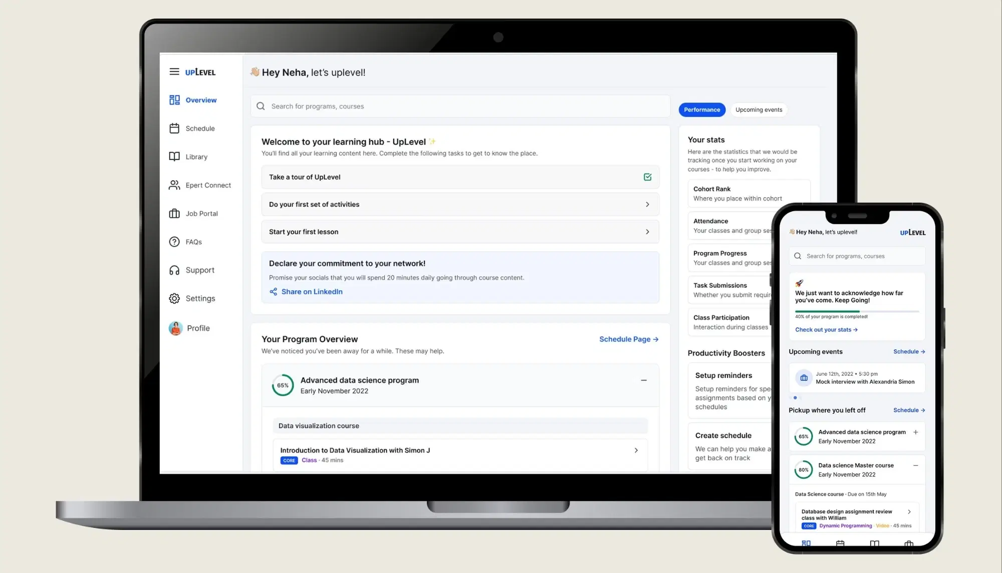
North Star Dashboard

This is the north star redesign that this case study builds toward.

Completion rates
weren't matching intent.

InterviewKickstart runs intensive, cohort-based courses for tech professionals breaking into or leveling up at big tech companies. Students pay a premium — and their consistency directly affects their outcomes.

When students lapse, both student and instructor miss their goals. The SSA team had been identifying this pattern through individual conversations and were looking for scalable interventions.

🎯
Scope Constraint
Due to technical bandwidth, we focused on the dashboard and its surrounding experiences — intentional, incremental change rather than a full platform overhaul.
📚
Content feels overwhelming
Dense material with no visible progress makes everything feel equally undone.
📅
Schedules don't bend
Only evenings & weekends available. Desktop-only restricts micro-moments of learning.
📉
The snowball gap
Miss one class → knowledge gap widens → re-entry feels impossible → silent drop-off.
🎤
Coaching underused
Mock interview slots left unused — students wait for "the right moment" that never comes.
👩‍💼
SSAs flying blind
No data layer — only manual 1:1 calls to identify struggling students. Unscalable.
🔍
No progress mirror
Students had no way to see how far they'd come — only what remained. Demoralising.

"A Low completion rate could have many causes. We chose to tackle progress visibility first — for students on the front end, and Instructors & Student success associates on the back end. This case study covers the student side."

— Design framing, after stakeholder alignment

Three ways I went
closer to the problem.

Direct access to students was limited — their schedules were already stretched. So I triangulated across three tracks to build a picture of the failure modes.

🗣
SSA Team Conversations
SSAs were my primary window into student behaviour — they'd been doing manual 1:1 check-ins for months. I structured conversations around patterns: who drops, what triggers re-engagement, and what they wish they could see earlier.
🔬
Competitive Benchmarking
Signed up for courses on Scaler, MasterClass, Coursera, and Master's Union. Read discussion threads across platforms. Specifically studying progress visualisation, re-engagement nudges, and the emotional tone of the dashboard.
👥
Network Interviews
Spoke to tech professionals in my network who'd taken similar intensive courses — not IK-specific, but enough to validate the patterns. What broke their consistency, and what actually worked for them.
Students progress when SSAs intervene personally
When the SSA team reached out directly — helping set up extra sessions, resolving blockers — students re-engaged. The data existed; it just lived only in those conversations.
Peer Discord groups help with student <> instructor interaction
For Every cohort, a discord group is formed, where students and instructors are added & SSAs monitor the chats - these are noted to be very useful for discussions.
Face to face sessions were kept for later
The team suspected students were hoarding coaching credits for "the right moment." SSAs had to manually remind the student to use the complimentary interviews sessions & schedule 1:1s if needed.
User Quotes
"I either one-shot it, staying up all night, or it's slow and fragmented. The break in momentum always hurts."
"Sometimes the courses are dry, and I lose sight of why I signed up."
"Shorter quizzes and videos I could do async during commutes. The longer videos need dedicated time, which is hard to find."

Four questions to
frame the design space.

With research synthesised, I mapped the opportunity space into four How Might We statements — each addressing a distinct layer of the drop-off problem. The numbers track through to the features in each phase.

1
How might we inform students of their progress?
  • Visual progress statistics surfaced above the fold
  • Cohort rank, attendance %, per-course completion
  • SSA visibility into the same data, in a monitoring layer
2
How might we restore context after non-attendance?
  • Pick up where you left off — surface last-viewed content
  • AI-generated class summaries for missed sessions
  • Low-intensity re-engagement nudges, not guilt trips
3
How might we offer support with tough content & tight schedules?
  • Contextual prompts to use coaching and mock interview slots
  • "Suggest a schedule" — input free time, get a catch-up plan
  • Core concept tags flagging which classes not to miss
4
How might we encourage consistent effort?
  • Goals + performance report surfaced upfront and tracked
  • Daily challenge commitment, shareable to social
  • Time-to-Value milestones — translate modules into capabilities
  • Mobile app for low-intensity async work (designed, out of scope)
📱
Mobile App — Designed, Out of Scope
A companion mobile app to facilitate engagement on the move — for the short quizzes, videos, and async activities that don't require a desktop. It's a proven engagement lever. While it was out of scope for this project, I designed for it anyway — the designs exist and can move into the next sprint.

A modular homepage
that follows the student's journey.

I structured the design around the three natural phases a student moves through — each with its own problems, emotional state, and targeted features. Each feature is tagged to the HMW question it addresses.

1
Just Joined

Getting oriented
in a new course.

Student's State
"I'm new here. What does this course actually look like? What are the milestones? How do I pace myself? What's most important to get ahead?"
  • No sense of the overall path — what all courses contain, and what activities lie ahead
  • Unclear what the important milestones are and how to pace towards them
  • No sense of priority — what's most critical to engage with first
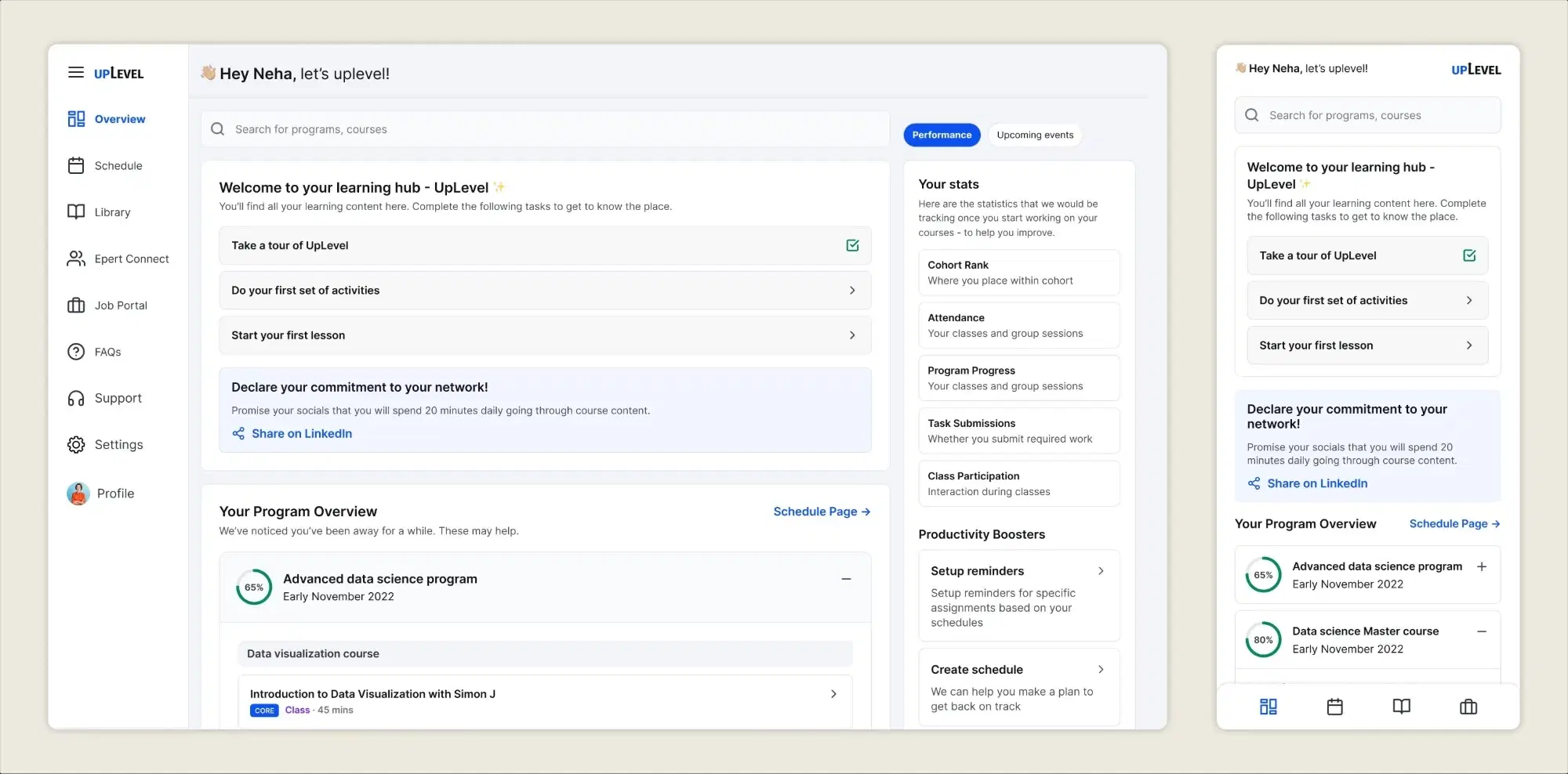
Phase 1 — Just Joined
HMW #1 · HMW #4
Redesigned dashboard — a map of everything
The homepage now shows all enrolled courses and their contents — organised, scannable, with a sense of the road ahead. No more "what do I even have left?"
Progress VisibilityInformation Architecture
HMW #4
Goals — set upfront, tracked always
Students are aware what metrics affect their overall performance, and are positioned better to keep them in check. Their course completion being tracked helps their pacing as well.
Goal CommitmentRetention
HMW #4
Declaration of commitment
A prompt to commit to spend atleast 20 minutes working on course content, helps with accountability & social reinforcement. Later additions could include prizes/call outs from IK
Habit BuildingSocial Accountability
A few weeks pass →
2
A Few Weeks In

Workload rising.
Momentum wavering.

Student's State
"I'm keeping up, mostly. But it's getting harder to remember what I studied last. I may have missed a class or two. I don't know how to evaluate my own progress or what to prioritise."
  • Hard to recall what was last studied — continuity breaks down across sessions
  • One or two missed classes has already created a gap they don't know how to bridge
  • No way to evaluate their own progress or decide what to prioritise
  • Risk of falling further behind without realising how close to a tipping point they are
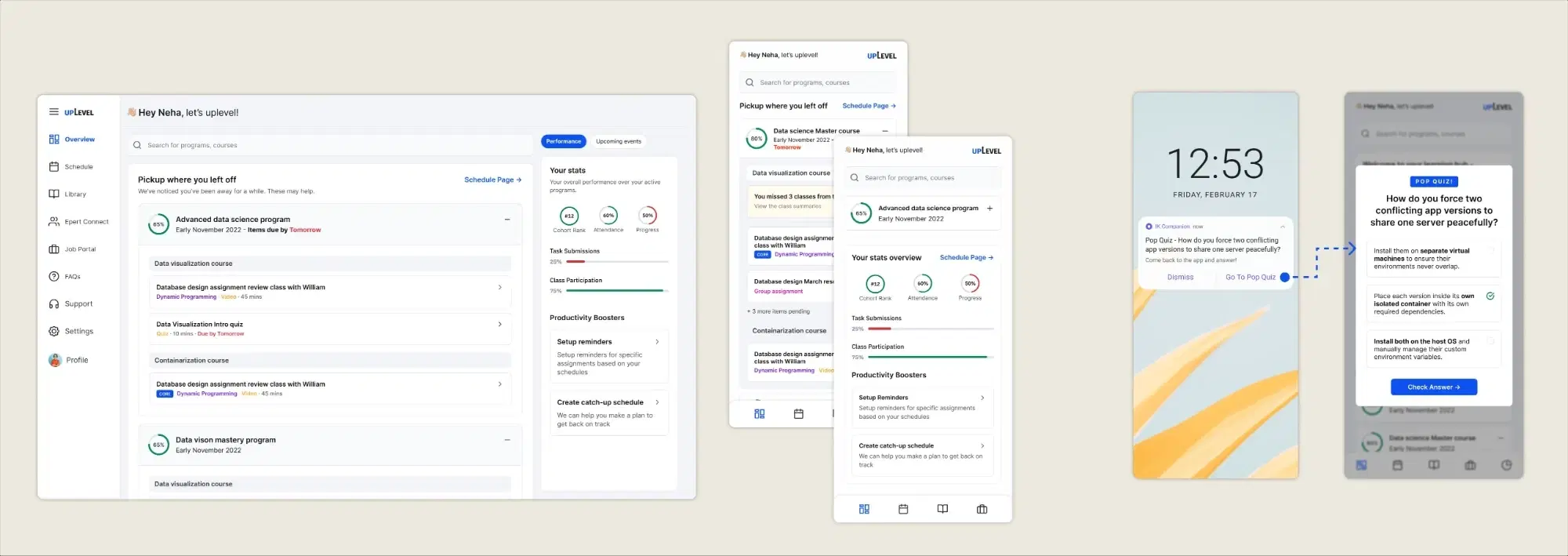
Phase 2 — A Few Weeks In
HMW #2
"Pick up where you left off"
A persistent re-entry card showing the last piece of content the student engaged with — specific lecture, timestamp, or assignment. The mental cost of "where was I?" is removed entirely.
ContinuityCognitive Load Reduction
HMW #1
Key performance stats — always visible
Cohort rank, attendance %, and course completion rings surface above the fold. Framed as "look how far you've come" — a reward, not a report card.
Progress VisibilityMotivation
HMW #2
Low-intensity re-engagement nudges
After periods of inactivity, simple push notifications/emails could re-engage the user and pull them back with interesting & low intensity activities - like a pop quiz for example
Re-engagementNudge Design
HMW #3
"Core concept" tag — what not to skip
A tag flags sessions where new foundational content is introduced — giving students a basis for prioritising their limited time, rather than guessing.
Priority ScaffoldingSchedule Support
Momentum falters →
3
Losing the Groove

Critical drop-off.
Is it too late to come back?

Student's State
"Work has been hectic. I've fallen behind. I've lost sight of why I even signed up. Is it too late to get back on track?"
  • Student is at the critical point of drop-off — motivation is at its lowest
  • Lost sight of the original goal that drove them to enroll
  • Overwhelmed by how much has accumulated — doesn't know where to start
  • No escalation path — the platform has no way to surface that they're struggling
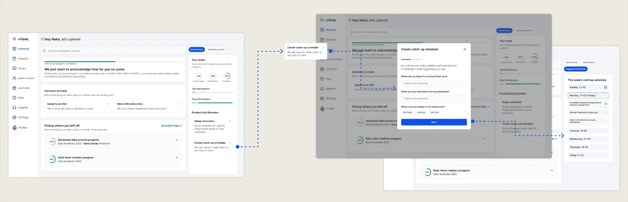
Phase 3 — Losing the Groove
HMW #3
Prioritise human intervention at the critical point
At Phase 3, the most effective intervention is a person — not a nudge. Students get a visible, low-friction way to book a 1:1, schedule a mock interview, or speak to an SSA directly from the dashboard.
Human EscalationSSA Integration
HMW #4
"Time-to-Value" milestones
Instead of "Module 4 of 10 completed," translate it into capability: "You can now design REST APIs." Abstract progress becomes real and worth protecting.
MotivationOutcome Framing
HMW #3
"Suggest a schedule" — a personalised catch-up plan
The student inputs their available time slots. The feature generates a focused catch-up plan from the most critical outstanding summaries — video clips, lecture links, self-test questions. SSAs can monitor and nudge follow-through.
Schedule SupportPersonalisationSSA Visibility

Scoped down.
Shipped with intention.

Limited budget and time, and multiple stakeholder conversations later — we stripped down to the highest-impact, lowest-risk changes. The SSA team was positioned to lead the personalised follow-ups beyond what the dashboard could handle.
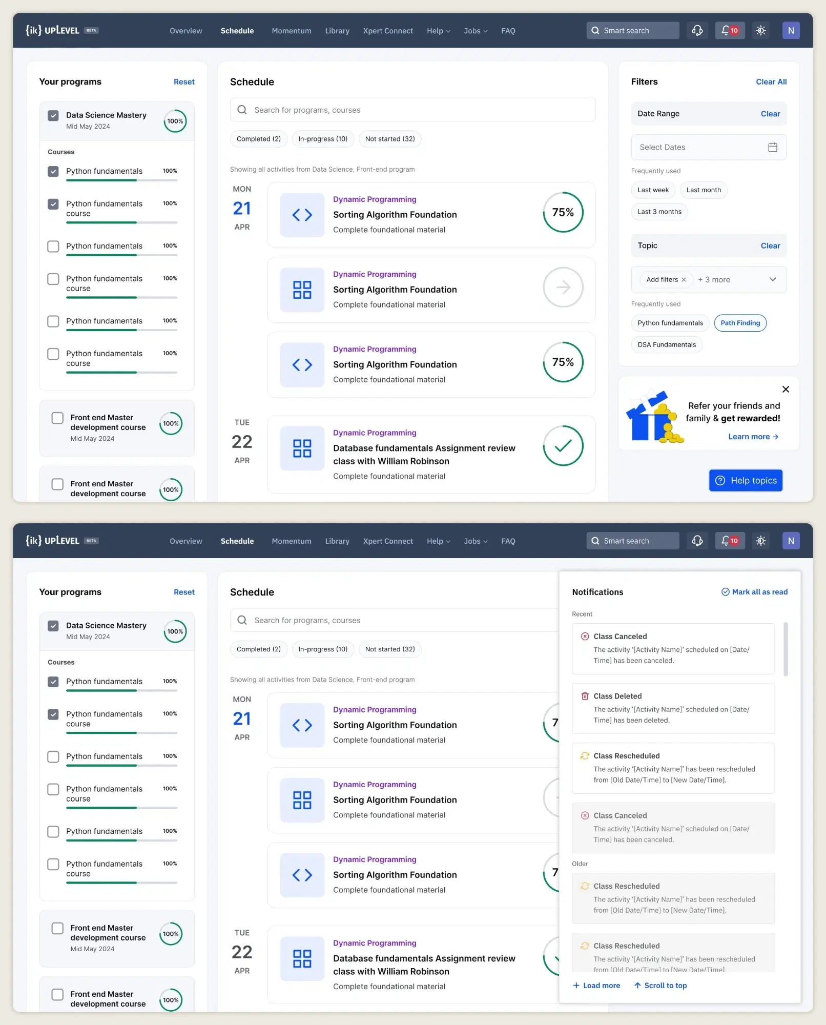
📊
Progress tracking — dashboard redesign
All the programs, courses progress were grouped and progress was tracked. Each activity too had it’s own completion tracker.
🔄
Dashboard rearrangement
Basic hygiene and logical grouping of sort & filters, and nesting of programs and courses.
🔔
Notifications — Live
Class reminders, deadline alerts, and coaching prompts. Shipped to production with positive student feedback on the IK Discord.
🔍
Global Search — Live
Our existing search was a basic keyword search - we updated it to a global predictive search with sort and filters.
📱
Tablet-responsive UI
The initial UI was only designed initially for large desktop, so we made another breakpoint and made the schedule page and activities responsive.
Scoped Down Design

How I'd measure it
when it goes live.

The redesign is in staging — quantitative data is pending. But good design anticipates its own measurement. Here's the framework I'd apply once this reaches a live cohort.

Metric
Why it matters
What a good result means
Course Completion Rate
The north star — this is what the entire project was trying to move.
Measurable lift in cohort completion % vs. the pre-redesign baseline.
Re-engagement Rate — % of lapsed students returning within 7 days
Directly measures if Phase 3 interventions (catch-up schedule, SSA nudges) are working.
A rising rate means the dashboard is pulling students back before they fully drop off.
Session Frequency — avg. sessions/week per active student
Shows whether the redesign changed day-to-day habits, not just first-visit behaviour.
Increase vs. baseline = the dashboard has become part of the study routine.
Feature Stickiness — % using new features week-over-week
Distinguishes features that integrated into workflows vs. ones ignored after the novelty wears off.
Sustained usage after week 3 = the feature has genuine utility, not just novelty.
Task Success Rate & Time on Task (qual, longitudinal)
Proves the layout works for intended tasks — finding progress, resuming content, booking SSA time.
High success + lower time-on-task = lower cognitive load, more intuitive design.
Error / Misclick / Dead Click Rate (quant)
Surfaces specific UI elements causing confusion — more precise than general feedback.
Low rate = IA is working; clusters of dead clicks point to exact components to revisit.
CSAT / SUS Score (qual + quant)
CSAT captures emotional satisfaction; SUS gives a standardised, comparable usability benchmark.
SUS ≥ 68 beats the industry average; CSAT improvement vs. baseline indicates perceived value.
UI / Usability Bug Tickets (quant)
Proxy for design quality post-handoff — high volume often signals edge cases missed in QA.
Declining ticket volume sprint-over-sprint shows the design is holding up in production.
Drop-off Curve by Cohort Week
Measures if the redesign flattened the spike around weeks 6–8 that originally motivated the project.
A flatter curve at weeks 6–8 is the clearest proof the intervention worked.

What I'd do
differently.

🔁
Contextual research from the start
I proposed user sessions — but budget didn't allow it. Guerrilla interviews helped, but sitting with a student mid-session would have surfaced problems the data never could. Worth fighting for.
📐
Baseline analytics before design
No event tracking on the existing page meant no before/after story. Scroll depth, click patterns, drop-off points — even basic instrumentation would have grounded the decisions.
🤖
AI-first if I did it today
Low AI familiarity in our user base constrained the approach then. Now I'd build a conversational, adaptive interface — Perhaps one that learns the student's schedule and tests them with personalized questions.
Hey, you made it
this far!
Dhananjay Kumar Gupta · Product Designer
Designed & developed by — yours truly.